How to Read Spot Price Charts: A Beginner's Guide to Technical Analysis
 Apr, 19 2026
Imagine staring at a screen full of red and green bars, wondering if the price is about to moon or crash. For most people, a price chart looks like a chaotic heartbeat monitor. But for traders, those lines and shapes are a map of human emotion. Whether it's greed, fear, or uncertainty, everything shows up in the price. Learning to read spot price charts is essentially learning to read the psychology of the crowd in real-time.
You don't need a degree in finance to get this. At its core, technical analysis is about spotting patterns that repeat. If a price hit $50,000 three times and bounced back up every single time, there's a high probability it will happen a fourth time. That's not magic; it's just how markets work. The goal is to stop guessing and start using visual evidence to make decisions.
Quick Summary: Key Takeaways
- Spot price refers to the current market price for immediate delivery.
- OHLC (Open, High, Low, Close) is the foundation of almost every professional chart.
- Candlestick charts are the industry standard because they show momentum through color and shape.
- Timeframes matter; a 15-minute chart tells a very different story than a 1-year chart.
- Confirmation is key; never rely on a pattern alone-use volume and support levels to validate.
Understanding the Basics: What exactly is a Spot Price Chart?
Before we look at the shapes, we need to define the entity. Spot Price is the current market price of an asset for immediate delivery and settlement. Unlike futures or options, where you bet on a price in the future, spot trading is happening right now. A spot price chart is simply a visual record of these transactions over a specific period.
To read these charts, you have to understand the
OHLC Framework, which
stands for Open, High, Low, and Close. Every single time interval on your chart-whether it's one minute or one month-contains these four data points:
Why does this matter? Because the gap between where a price started (Open) and where it ended (Close) tells you who won the battle: the buyers or the sellers.
Choosing Your View: Line, Bar, and Candlestick Charts
Not all charts are created equal. Depending on what you're looking for, you'll want to switch your view. Most platforms like TradingView or Binance let you toggle between these three styles.
The simplest is the Line Chart, which connects only the closing prices of each time interval. It's great for zooming out to see the "big picture" trend without getting distracted by the noise of daily swings. If you want to see if an asset is generally trending up over five years, use a line chart. However, it hides the volatility, meaning you can't see how wild the price swings were during the day.
Then you have Bar Charts. These provide the full OHLC data in a vertical line. A tick to the left shows the open, and a tick to the right shows the close. They are precise, but they aren't very intuitive. You have to squint to see if the price actually moved up or down.
This is why Candlestick Charts are the gold standard. Originating from 18th-century Japanese rice traders, they use a rectangular "body" to show the range between the open and close, and thin "wicks" (or shadows) to show the high and low.
| Chart Type | Data Shown | Best For... | Main Weakness |
|---|---|---|---|
| Line Chart | Close Price Only | Long-term trend analysis | Hides intraday volatility |
| Bar Chart | Full OHLC | Professional futures trading | Lacks visual intuition |
| Candlestick | Full OHLC + Sentiment | Day trading & Crypto | Can give false signals in low volume |
Mastering Timeframes: The Zoom Effect
One of the biggest mistakes beginners make is focusing on only one timeframe. If you only look at a 15-minute chart, you might see a "crash" that is actually just a tiny dip in a massive 1-year uptrend. This is called "timeframe confusion." To avoid this, professional traders use a top-down approach.
First, they look at the 4-hour or Daily chart to find the general direction (the trend). Then, they drop down to the 1-hour chart to find a specific pattern. Finally, they use the 15-minute or 5-minute chart to time their actual entry. It's like using a map of the country, then a map of the city, and finally a street-view map to find the exact front door.
If you are a long-term investor, you'll spend most of your time on 1-year or 5-year charts. If you're day trading, your world exists in the 1-minute to 1-hour range. Just remember: the longer the timeframe, the more "weight" the signal carries. A bullish pattern on a weekly chart is far more significant than one on a 1-minute chart.

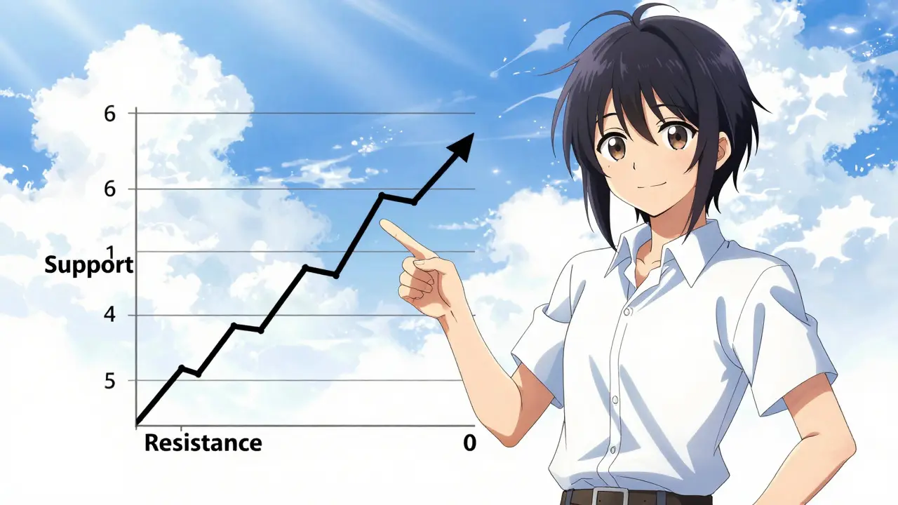
Reading the Signals: Support, Resistance, and Patterns
Once you can read the candles, you need to find where the price is likely to stop or turn. This is where Support and Resistance come in. Support is a price level where a downtrend tends to pause due to a concentration of buying demand. Think of it as a floor. Resistance is the opposite-a ceiling where selling pressure prevents the price from rising further.
A level isn't "real" just because the price touched it once. A valid support level usually needs to be tested at least twice, with a noticeable bounce. When the price finally breaks through a resistance ceiling, that ceiling often turns into the new floor (support). This is a key concept in price action trading.
Beyond these levels, you'll see patterns. For example, a "Head and Shoulders" pattern usually signals that an uptrend is ending. You'll see a peak (shoulder), a higher peak (head), and another lower peak (shoulder). When the price drops below the "neckline" connecting the lows, it's often a signal to sell. However, be careful: patterns can fail. A 2022 analysis showed that triangle breakouts often fail if they aren't backed by a surge in trading volume.
The Golden Rule: Always Confirm with Volume
If you only look at the price, you're only seeing half the story. Trading Volume is the total amount of an asset that changed hands during a specific time period. Volume is the fuel that drives the price.
Imagine the price is breaking through a resistance level. If the volume is low, it's likely a "fake-out"-a trap that lures in buyers before the price crashes back down. But if the price breaks out and the volume spikes 150% above the average, that's a high-conviction move. It means the "big money" (institutional traders) is behind the move, not just a few retail traders.
Combining chart patterns with volume analysis is what separates profitable traders from gamblers. A bullish engulfing candle (where a large green candle completely covers the previous red one) is a strong signal, but it's a dominant signal only if the volume on that green candle is significantly higher than the previous few days.
Avoiding the Common Pitfalls
Reading charts is a skill that takes time. Research from Babson College suggests it takes nearly 90 hours of deliberate practice to identify patterns with decent accuracy. Most people quit before they hit that mark because they fall into these traps:
- Over-trading: Trying to find a pattern in every single candle. Sometimes the market is just sideways (choppy), and the best move is to do nothing.
- Ignoring the Macro: Looking at a "perfect" chart pattern while ignoring a massive global news event. Technicals are great, but a sudden financial crisis or a major regulatory change can override any chart pattern instantly.
- Analysis Paralysis: Using too many indicators. If you put ten different lines and colors on your chart, you'll get ten different signals. Keep it clean. Focus on price, volume, and a few key moving averages.
What is the difference between a spot chart and a futures chart?
A spot chart tracks the actual current price of the asset. A futures chart tracks the price of a contract to buy that asset at a later date. While they usually move together, futures charts can show a "premium" or "discount" compared to the spot price based on market expectations for the future.
Can I use these charts for long-term investing?
Yes, but you should change your timeframe. While a day trader looks at 15-minute candles, a long-term investor should look at Weekly or Monthly charts. This helps you ignore daily "noise" and identify the primary trend of the asset over years.
What is a "fake-out" or a "whipsaw"?
A fake-out happens when the price breaks above a resistance level (making it look like a breakout) but then quickly reverses and drops back down. This often happens in low-volume markets and is why confirming breakouts with volume is so critical.
Which chart type is best for beginners?
Start with line charts to understand the general direction of the market. Once you're comfortable, move to candlestick charts. Candlesticks are the most widely used because they provide the best balance of detail and visual intuition.
Does technical analysis actually work?
It doesn't predict the future with 100% certainty, but it manages probability. Chart patterns work because humans tend to react to price levels in predictable ways. When combined with risk management, it allows traders to make decisions based on data rather than emotion.
Next Steps for Your Charting Journey
If you're just starting, don't put real money on the line yet. Try "paper trading"-this is where you use a demo account to predict price movements based on the patterns you've learned.
Start by picking three assets and looking at their 1-day charts. Try to identify the major support and resistance levels. Then, zoom in to the 1-hour chart and see if you can spot any candles with long wicks, which often signal a price reversal. Once you can consistently predict the direction of the move (even if you can't time it perfectly), you'll have the foundation needed to start trading with real capital.
Sara Ellis
April 21, 2026 AT 06:55charts are just mirrors of our own souls man... the red and green is just life and death in a digital box
Robert Mosolygo
April 22, 2026 AT 16:33You are ignoring the obvious manipulation by the central banks. These patterns are not natural; they are engineered by algorithmic bots to trap retail liquidity. If you actually analyzed the order flow, you would see that the "support levels" mentioned here are simply bait for the whales to liquidate us. It is all a choreographed dance of deception designed to transfer wealth upward. Wake up and stop trusting a chart that is painted by the very people who want you broke.
Lisa Camp
April 22, 2026 AT 16:38STOP OVERTHINKING AND JUST TRADE! GET IN THE GAME OR GET LEFT BEHIND!
Mike Word
April 23, 2026 AT 15:21The concept of the OHLC framework is quite standard across different global markets, not just crypto. I wonder how these patterns vary when looking at emerging market currencies compared to established ones.
Clair Geary
April 23, 2026 AT 18:36this is such a sparkly way to explain a scary topic
totally love how the top-down approach is broken down into a map analogy
Sarah Ingrams
April 24, 2026 AT 14:58learning is a journey
Doc Coyle
April 24, 2026 AT 23:37It is a basic guide. Most people will still lose money because they lack the discipline to follow these rules.
Ellie Drews
April 25, 2026 AT 05:26I think it's really helpful for someone who feels overwhelmed by the interface. Just take it slow and don't feel rushed to trade.
Kyle Bush
April 27, 2026 AT 01:31USA TO THE MOON 🚀🚀🚀 THESE CHARTS ARE JUST PROOF THAT WE OWN THE MARKET 🇺🇸💪🔥
Caiaphas Konkol
April 28, 2026 AT 18:17The naive assumption that retail traders can profit from a 15-minute chart is almost quaint. True market dynamics are hidden in the dark pools where this "technical analysis" is completely irrelevant.
Gloris Young
April 30, 2026 AT 02:24Nice breakdown. Very clean.
Hannah Rubia
May 1, 2026 AT 18:53I would suggest that newcomers also investigate the Relative Strength Index (RSI) as a complementary tool to the volume analysis mentioned in the text.
Mary Tawfall
May 3, 2026 AT 13:26This is so encouraging! I've always been afraid of the charts, but the way this explains the "zoom effect" makes it feel manageable.
Miranda Jamieson
May 4, 2026 AT 09:15If you're still using a line chart in this day and age, you're basically trading with a blindfold on. Get a clue and use candlesticks or just admit you're not cut out for this.
Paige Raulerson
May 5, 2026 AT 00:52The formatting of the table is a bit lazy, but I suppose for a "beginner's guide" it suffices. Though I find the obsession with candlesticks quite pedestrian.
praveen subbiah
May 6, 2026 AT 11:13INDIA WILL LEAD THE TECH REVOLUTION AND OUR TRADERS WILL CONQUER EVERY CHART!! 🇮🇳🇮🇳
Guy Bianco
May 7, 2026 AT 15:49It is imperative that one maintains a disciplined approach to paper trading before committing actual capital. :)
Ali Tate
May 8, 2026 AT 02:39imagine thinkin a head and shoulders pattern actually matters when the fed is just printing money into a void lol absolute joke
Findlay Duncan Lyon
May 9, 2026 AT 23:13Spot on. Very concise.
Larry Yang
May 10, 2026 AT 18:43The authur assumes people actually have the patience for 90 hours of practice. In reality, most just ape into a coin and wonder why they're down 90%.
Alex Wan
May 12, 2026 AT 15:58I am truly thrilled to see such an inclusive guide for the novices! Let us all strive to learn these patterns together in a spirit of collabaration!
Greg Reynolds
May 13, 2026 AT 20:20Actually, the assertion that a 1-year chart carries more weight than a 1-minute chart is a gross oversimplification. In a high-frequency environment, the 1-minute chart is the only thing that determines the immediate execution price.
Sarah Fisher
May 14, 2026 AT 04:18It's interesting how we try to quantify human emotion through these bars. It's almost like we're trying to find a mathematical formula for greed.